This topic was suggested, more or less, by Phil Fortier.
What do these screenshots from Doom, Leisure Suit Larry 3, and Secret of Monkey Island have in common?
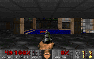
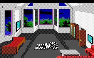
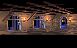
Their perspective. Every single wall is a straight line. I put Doom there to show it’s not just adventure games, and Monkey Island because the arcs end in straight lines, but otherwise they all have the same perspective. Don’t believe your eyes? Here, let me spell it out for you:
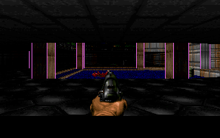
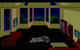
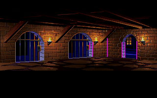
This is one-point perspective, where lines converge to a single point.
Here’s a Youtube video I picked out at random from my search results while I ensured I wasn’t pulling crap out of my ass. You’ll notice a hallway like that could do well as an adventure game background.
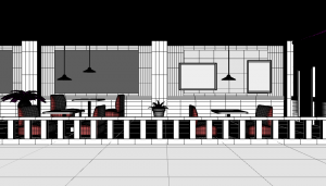
They’re also a pain in the ass when you render your game’s backgrounds with a program that doesn’t do 1PP, like I do. I mean, I could use this copy of 3D Studio Max that I have collecting dust over here, but all my prefabs are in Daz Studio? So I gotta fake it somehow. Very carefully align the camera so the walls point straight up.
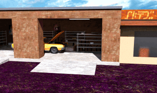
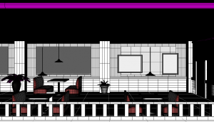
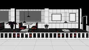
In this old version of Alhor’s Garage in The Dating Pool, the walls are not straight. So I went back and tweaked the camera along with a few other details.
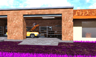
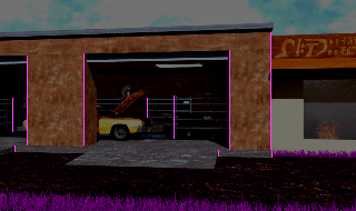
I feel much better about this version. But for other scenes, to get enough floor space in view, I have to pull back the camera drastically. Normally you’d increase the floor space by angling the point of view down. I’m sure you can agree that in Chairman Kenneth’s office, the camera is pretty far up. If I tried to reproduce that image in Daz, I’d get diagonal walls. So how do you fix that?
There’s practically no floor space here! If I used this, the main character would have a line to move along, and if other characters were to try and pass there’d be almost no space to show it. Moving the camera up mostly increases the ceiling space…
And of course you could fake it by tilting the walls back to compensate.
Or you can just say fuck it and deem the perspective distortion negligible after downsampling.
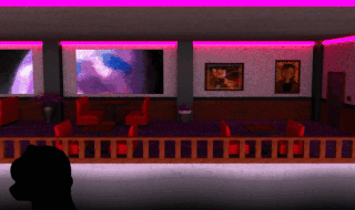
*sigh*
I seriously wish I had the means to acquire some nicely painted backgrounds, even after years of demos with rendered ones.
