From day one, the title screen for The Dating Pool has been rendered, with one short intermission. Looking back at my development archives, I felt I should show the unseen. So in the inimitable words of Verka Serduchka… Let’s begin!

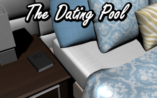
The original title screen was a closeup of the main character’s little black book, in what was then planned to be her bedroom. Between the default textures and the book’s cover being edited in post, I honestly can’t remember why I replaced it… but it’s not exactly evocative of a “dating pool”, or any kind of pool, really.

Ah, the original demo release’s title screen. This is actually slightly newer than it should be at this point, with the wine and glass added, but who’s keeping track? Maybe me at best, but I hardly did. Anyway, I’m not gonna hunt down a copy without the wine only to post this version a little later.

At one point I figured the 3D renders could serve as the basis for pixel art redraws. I put hours into this image, only to not use it at all. Honestly, I can’t quite remember why I gave up on that idea. But before the demo was in a playable state, I’d reverted to the render and added the wine. Perhaps it was just to not increase the workload even more, or maybe it was because it didn’t actually help solve some issues with global palettes that I’d hoped it would. Oh well, what’s a few wasted hours when you have this much free time to waste to begin with?

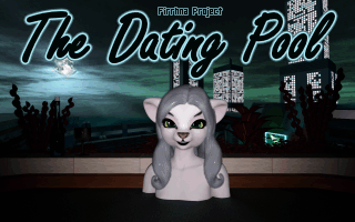
And that brings us to the title screen as it is now. The Itch demo has a slightly earlier version of this screen that’s a bit shinier in silly places, but otherwise it’s the same.
(2018 note: the above paragraph was later outdated by an updated demo release.)
I wonder if should put some animation in this. The old screen had the flickering candles… Anyone?


